18 Best Wedding Website Examples: How Can Look A Perfect Wedding Site
WebBuildersGuide.com earns commission from some of the web builders and hosting providers listed on this website. Learn moreGone are the days when couples used to think a lot about invitations and how to show people what a great day means to them. Couples like you make modern wedding websites that can be used as wedding invitations, inform the guests regarding any information they might seek, and describe the couple’s story.
Couples worldwide have created beautiful wedding websites that are informative but entice guests to celebrate the big day. Your website needs to be as personal as possible; it must sound like you and feel like you. Beautiful color palettes that reflect the theme on the wedding day are usually used alongside the musical playlist and the graphic representation of what guests could expect at the venue. Usually for creating wedding websites couples use special wedding website builders featuring lots of wedding templates. Most websites use the RSVP feature, location feature for guests to reach easily, gift registry feature, and other related information.
To provide some inspiration, we have gathered some examples of websites and judged them upon their visualizations and their functions that help the guests attend the wedding.
Below are our 18 best wedding website examples:
Brooke & Stephen Beautiful Wedding Website
Made with Wix
Template used: Wedding Invitation
Check wedding website
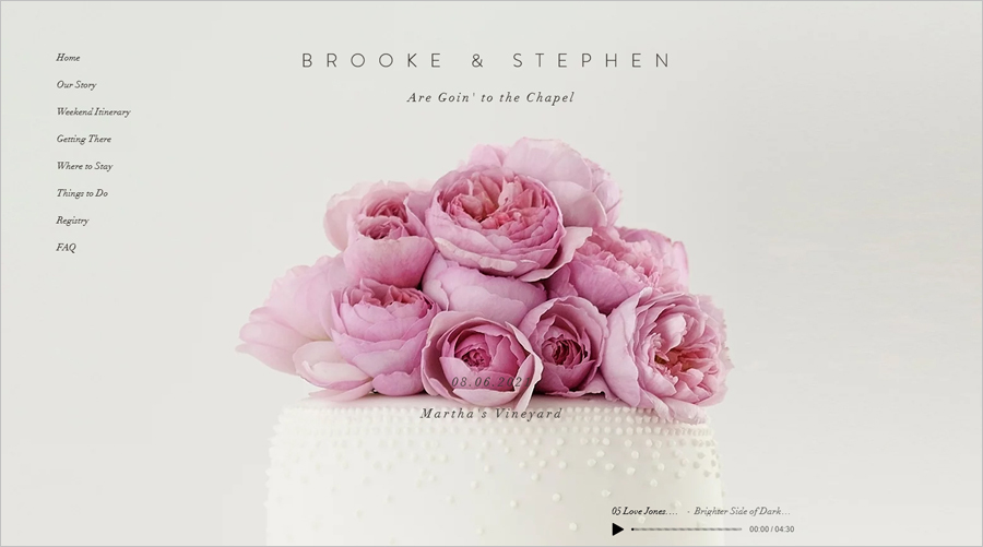
Brooke and Stephen’s wedding website is a beautiful inspiration as the first glance on the website gives you the wedding atmosphere. The pink roses and the light grey background are soothing for the eyes of the viewers. The first scroll lets you see the wedding venue and the exact date so that it is easy to remember.
This website tells how the bride said yes in sweet and short words. This website displays a great deal of information by initially informing the guests about the itinerary, the way to reach the destination from two different areas, arrangements to stay, and how can a gift registry be made. The website tells the how the guests can explore the area and what attractions it has. Finally, the website answers the questions frequently asked by the guests.
Elisabeth & Byron Light Wedding Website
Made with Weebly
Template used: Ariana & Hunter
Check wedding website
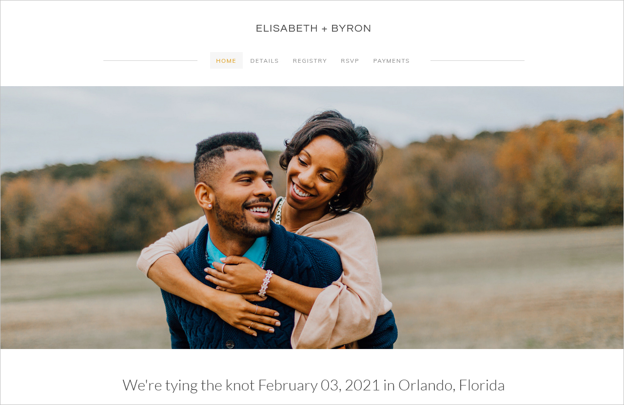
This website highlights the couple’s love story with a plain and straightforward white-colored background so that the images are more visible. As you scroll down, you can mostly see nothing other than the couple’s photographs and story. At the end of the homepage, the guests are informed about the wedding day.
This wedding is an example of a destination wedding; hence, the website shows the details of the 3-day wedding plan for the guests. The registry page provides options for guests to order gifts online. The RSVP and Payments pages are made simply for the ease of guests who want to attend the wedding and stay at the venue that the couple has reserved.
Andrew & Delphine Functional Wedding Site
Made with Squarespace
Template used: Soria
Check wedding website
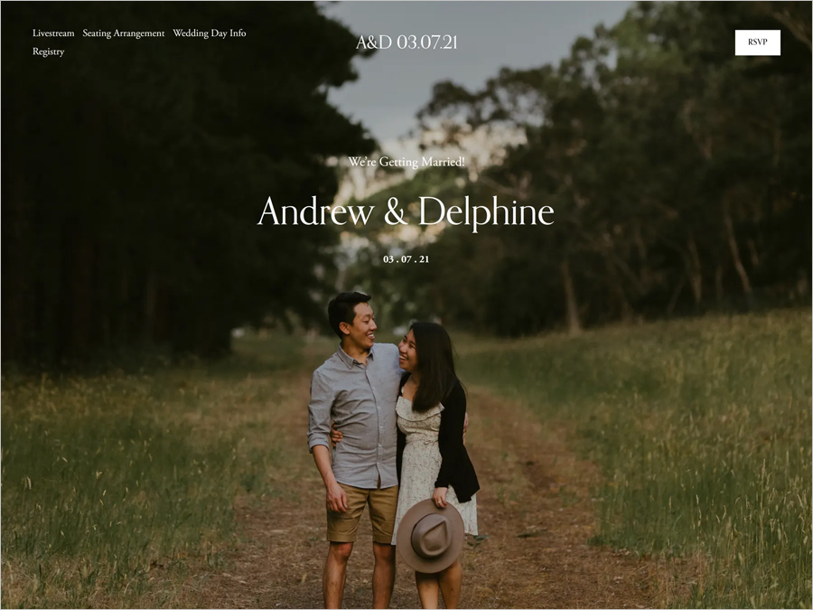
A well thought and well-designed modern wedding website seems like the website Andrew and Delphine created for their big day. Most of what you see is the high-quality images of the couple with a crisp and easy-to-read font.
Apart from all the functionalities of a standard wedding website, this website has an option of live streaming for those who want to celebrate the day with the couple but can’t be there in person. All the information regarding the wedding day (the dress code, the location, and the accommodations) have been assembled under a single page heading of wedding day info. A page has been dedicated to the seating arrangements made for the guests based on who would RSVP by clicking on the given button at the top right corner.
Johnny & Christine Classic Wedding Site
Made with GoDaddy
Check wedding website
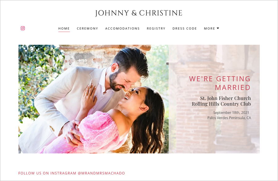
This website is an example of a beautiful and graceful wedding website with light colors and explicit texts. Almost all the HD-quality pictures have been taken in daylight, making them pleasant to look at. At first glance, you can see a menu that will provide every bit of information the guests require and an Instagram link to the couple’s handle.
Johnny and Christine’s wedding website has been designed so that the direct menu answers all the questions regarding the venue and the wedding day. The ceremony page includes details of the main ceremony and the following events. Similarly, you can view the accommodation options and the registry options on respective pages. Superficial details are also incorporated in later pages, such as dress code, couple story, and contact details.
Sonny Minimalistic Wedding Website
Made with Squarespace
Template used: Sonny
Check wedding website
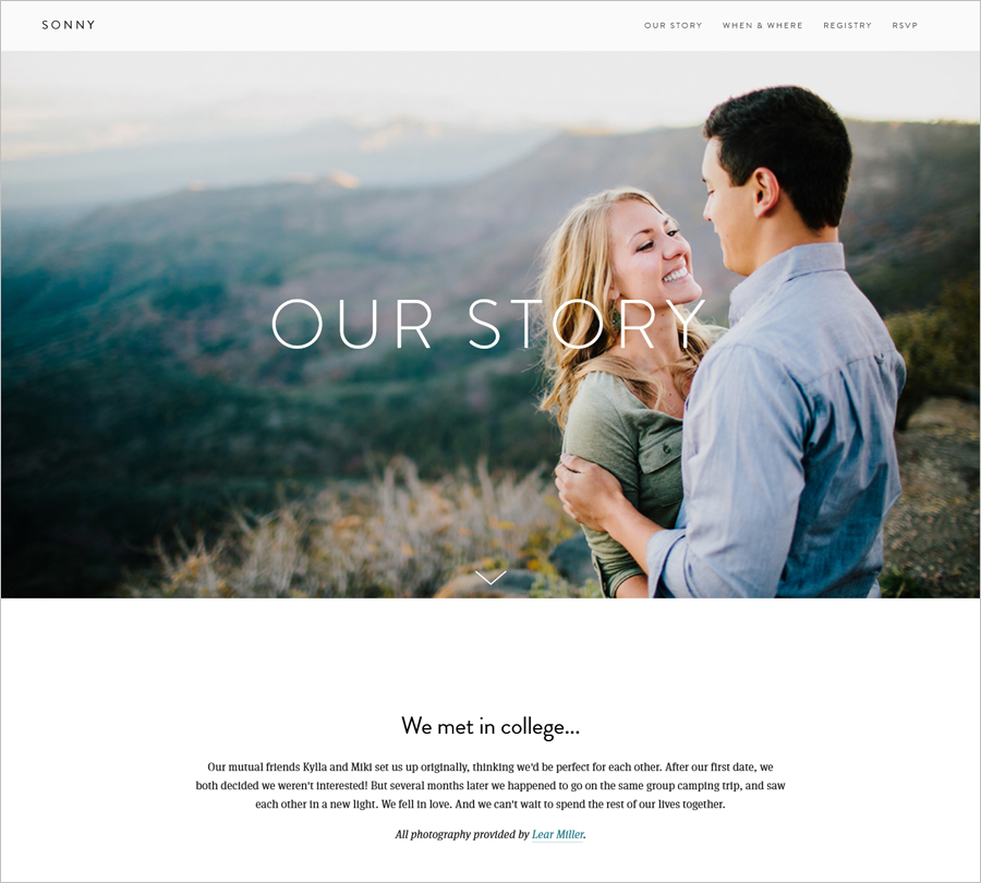
Wedding invitations won’t be any minimalistic than this. If you are looking for a simple website design, this website can be your inspiration. Prepared with small fonts and a lot of space for high-quality couple photos, this website has more to show than to say. The website uses white-colored fonts in front of the pictures to convey the information about the wedding.
The first scroll to the very end reflects the couple’s journey leading to the proposal by the groom. The wedding location is beautifully displayed with information on accommodations that will have group discounts. The registry page displays a list of options for gifting via zola.com. Finally, an RSVP page asks for the information from the guests attending.
Luc & Casey Modern Wedding Website
Made with Wix
Check wedding website
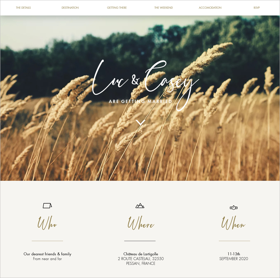
This website is one of the best wedding website examples as it is diverse from any other website in its personalization and whole outlook. This website has eloquent images of the venue rather than the couple, and the font symbolizes handwritten typography, adding a romantic touch.
If you are looking for inspiration on a destination wedding, this website might be the one. You can observe small details with icons letting the guests know how to get to the wedding via plane, taxi, or train. Furthermore, it also highlights the places where the guests might stay.
Anya & Deven Classic Wedding Website
Made with Squarespace
Template used: Anya
Check wedding website
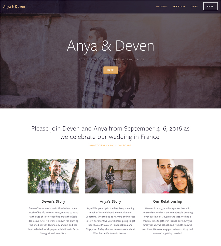
Anya & Deven have created a wedding website for themselves that displays the eternal love shared between the couple. A simple yet elegant website with white background highlights the high-quality images of the couple – the questions of When and Where have been answered as you scroll down.
This website is unpretentious and direct in displaying the information required by the attendees. As this might have been a destination wedding, the location has been thoroughly inquired about and mentioned details. You can observe that the website informs about the traveling, the hotelling, and the activities that the guest might indulge in. The viewers might notice the gifts page, which tells the guests, in big, bold fonts, not to gift anything other than fund the couple’s honeymoon – a great way to enjoy your honeymoon at others’ expense.
Philip & Nicole Colorful Wedding Site
Made with Wix
Template used: Wedding Invitation
Check wedding website
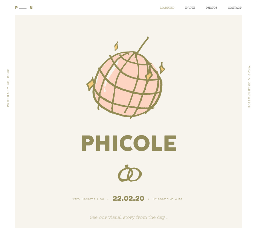
What a groovy way of celebrating the love the couple has created. This first glance exhibits the true essence of celebrating love from fun and festive point of view. The video below that has enhanced the disco ball icon shows a disco ball overhead, the couple dancing casually and calmly. The colors used are gold and pink throughout the website for a harmonized structure.
The website structure highlights the mood of the wedding (Phicole fest, as the couple named it) by using a funky font and using videos of the couple enjoying the wedding. The invite page shows all the details, including the itinerary, the arrangements to stay and travel, the dress code, and the gift registry details. Finally, there is a lot of emphasis on the photos of the celebrations, and one can view the couple’s journey as well.
Tmak & Jimmy Easy Wedding Website
Made with Weebly
Template used: Ariana & Hunter
Check wedding website
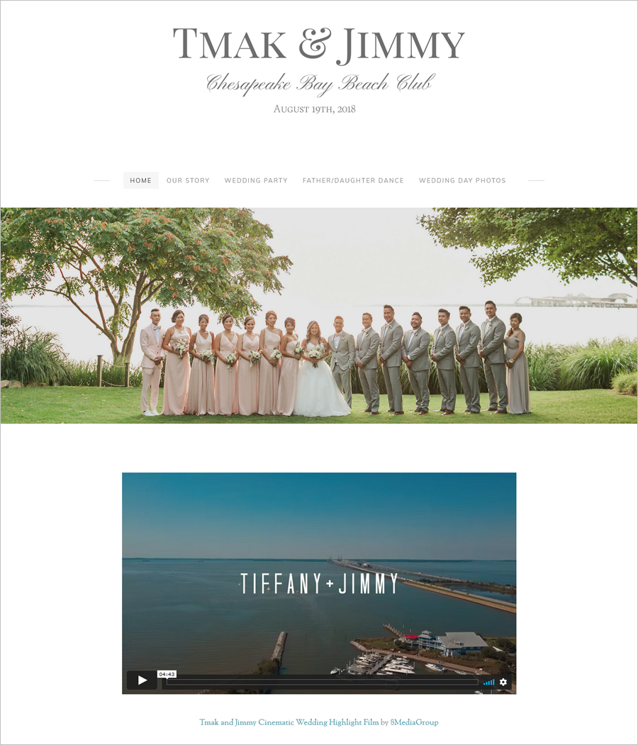
Teak and Jimmy’s wedding website signifies gentleness and grandeur in every sense possible. The calligraphic fonts and the combination of grey and pink reflected in the wedding day pictures demonstrate the impression of symmetry and opulence. The video after the title image is a showcase of the couple getting ready for the wedding and the wedding party.
The functionalities in this website are a bit different from any standard website as the emphasis is basically on the story and the people around the couple. The wedding was a one-day event, so the venue and the date have been displayed as the website’s title. Dedicated pages have been designed for the journey leading to the wedding day, the wedding party, the father-daughter dance, and a photo gallery of the wedding.
Naomi & Aaron One-page Wedding Site
Made with Squarespace
Template used: Naomi
Check wedding website
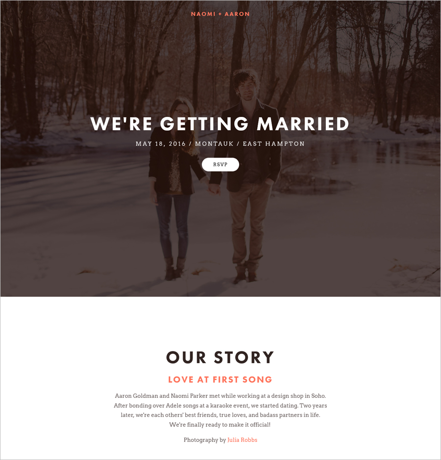
This website gives out dichromatic vibes reflecting the couple’s partnership in this marriage. Dark brown background and white fonts, and vice-versa, present a perfect contrast making the fonts stand out and easy to read. If you are looking for a one-page website, this is the best wedding website example for your inspiration.
The website is not overwhelming with details, and as you scroll down, you can see a small introduction to the couple’s story. Next, the viewers will get to know the date and the event details. Following is the option of the hotel for the guests to stay in. Photos of the couple have been displayed in a 4 x 3 grid with the gift registry options at the end.
Chris & Jess Cartoon Wedding Website
Made with Webflow
Check wedding website
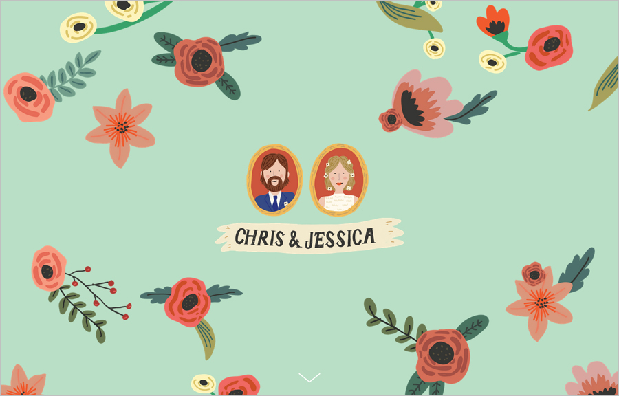
Happiness and Joy can be felt from the first moment the website opens. Cartoonish figures of the couple and drawings of flowers give out a fun sensation. The tea pink and aqua colors combine to make the viewers ecstatic. The icons and pictures also reflect the couple’s sentiments at this wedding.
This website has a mediocre level of text written, which can be seen in the couple’s story, details of the wedding party, accommodation, and transportation arrangements available. Detail has been provided for guests’ ease, and a map is also provided to locate the places to stay nearby. The couple has even given the contact details if the guests have questions.
Nikki & David Love Story Website
Made with Wix
Check wedding website
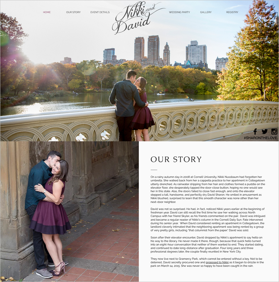
‘Love is in the air is the quotation that comes to mind while looking at a beautiful wedding website. The topography and the picture highlight a very soothing and romantic ambiance that the wedding will follow. As you scroll down, you can observe beautiful high-quality pictures of the couple and the wedding venue.
The couple’s story is detailed for the viewers leading to the proposal. Next, the details of the event and accommodation have been given. There are two menus in the title; the left side menu can be seen on the first-page scroll. The right-side menu incorporates the photos of the wedding party and the gallery with a couple’s images and the gift registry.
Aubrey & Paul Gentle Wedding Website
Made with Squarespace
Template used: Aubrey
Check wedding website
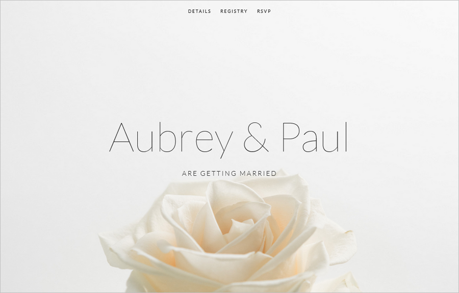
This website is a practical, clear, and beautiful example of a wedding website that is soothing to the eyes and has a soft romantic aura. The transparent background of a pink rose, and the slender font style enhance the website’s beauty.
There is no option to scroll down on the homepage as it has only the name of the couple and the 3-heading menu. The detail page shows all the relevant details related to the event and the reception. The contact details have been given for any further information. The registry page shows the options for gifts that the guests could buy online. Finally, an RSVP button gives a form to fill out, including all the details required.
Luiza & Alexandre Music Wedding Site
Made with Wix
Check wedding website
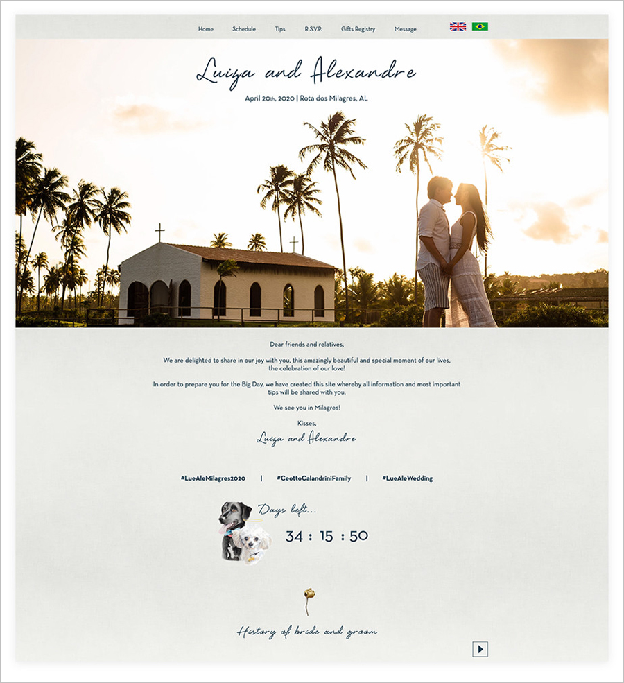
It is a beautiful destination wedding website that shows the love between the couple and their traditional church wedding. This website incorporates a unique sense of welcome for the Portuguese-speaking and English-speaking guests. Another unique thing about this website is the countdown clock widget applied to the website for the guests and the hashtags for social media at the bottom of the homepage.
This website is an excellent example of personalization that has been done precisely according to the couple’s requirements. The website informs the guests about the schedule of the event, the transportation options available to reach the venue, and the places to stay nearby. Finally, as a typical space utilization, RSVP, and registry pages have been added alongside a page for messages by the guests to the couple.
Luke & Charlotte Wedding Website
Made with Squarespace
Template used: Charlotte
Check wedding website
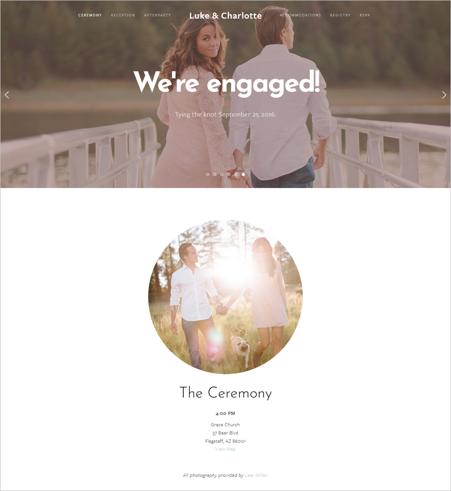
Love stories are forever, and this wedding website can acknowledge Luke and Charlotte’s love stories. As the website opens, a whole-width slide show appears reflecting the couple’s love story. At first glance, a lot of white space appeals to the viewers signifying purity and affection.
Circular photos give a unique outlook, and the details of the ceremony, reception, and after-party can be seen below the pictures. The fonts are easily readable, and colors highlight the text on the white background. Dedicated pages have been built for informing the guests about the hotels nearby the venue, the gift registry, and the fill-out form for the guests who want to RSVP. Simple yet practical, this can be your inspiration for your wedding website.
Sarah & Stephen Clean Wedding Website
Made with WIX
Check wedding website
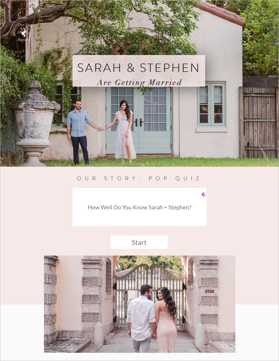
This is an example of a modern wedding website and can be your inspiration if you would like a personalized point of view for the viewers. The full-width HD quality image of the couple used as the background and the text saying that the couple is getting married is a beautiful opening for the website. A unique thing about the website is the pop quiz for the viewers who know the couple and their history.
This one-page website gives details of the church wedding and the reception. It is to mention that the couple apologized for the event of reception as close family will be invited only due to the pandemic. Finally, the registry options have been displayed for the guests at the bottom of the website.
Rebekah & JP Wedding Website with Big Header
Made with WIX
Check wedding website
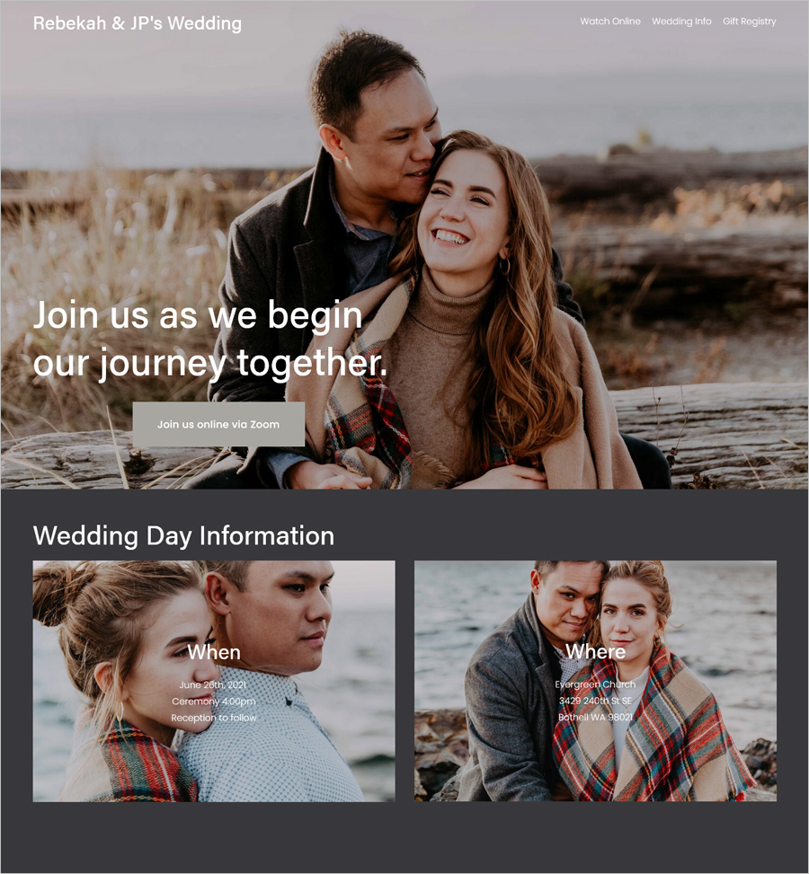
A wedding website displays a screen-size header image highlighting the love shared between the couple. The color combination is subtle, with white being the color of text and the background in the shades of grey. The images have been used as backgrounds for informing the when and where of the wedding day.
The best and unique feature of this website is the option to watch the wedding online via zoom. This feature is helpful, especially in times of pandemics and for people who cannot attend the wedding. Another noticeable observation is the detailing of wedding info and the maps for the church, and the map for a camping event. The couples included options for guests to pool in for their dream house or fund for their honeymoon.
Julia & Sam Easy Minimalistic Wedding Site
Made with Squarespace
Template used: Julia
Check wedding website
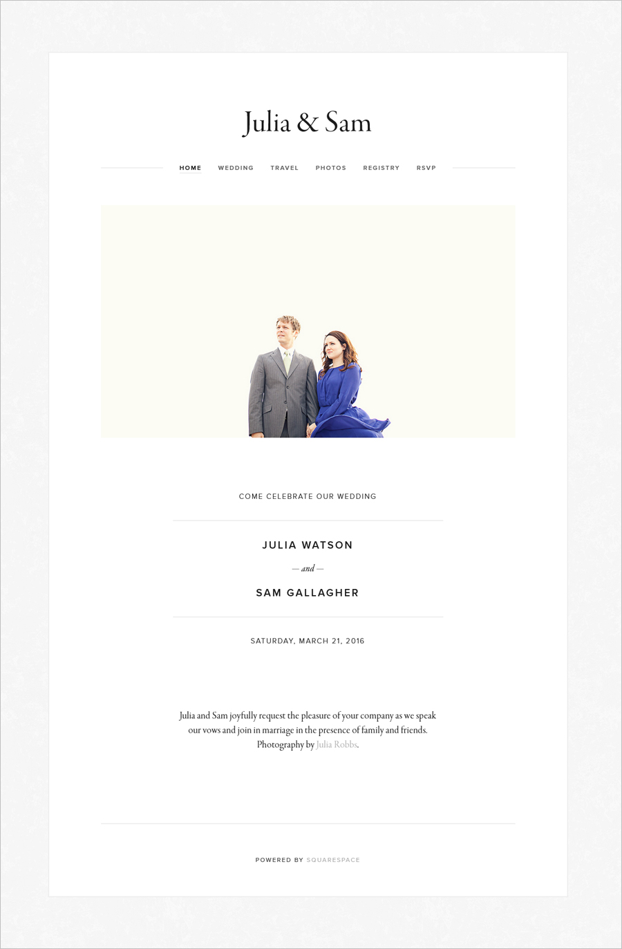
As you open this beautiful wedding website, the first word which comes to your mind is exquisiteness. The purity and freshness of the white color are all in the air, which signifies the pure love story of the couple. The menu displays all the respective details on the top of this website.
The website doesn’t have any sharp colors or images that prick the eyes; instead, it has an elegance that shows the couple’s affection. The website gives the registry button, RSVP button, and photos button. The beautiful and high-quality images attract you the most. Although the site is minimalistic, it defines every aspect of invitation in a very simplified and particular manner. The topography and the white spaces emphasize the photos of the couple, reflecting the journey of their undying love.
No comments yet